 Joshua Crockett
The Hockey Writers
26
Reads
0
Comments
Penguins’ Stadium Series Look Isn’t Great
When the 2017 Stadium Series kicks off at Heinz Field on Saturday, Feb. 25, the Pittsburgh Penguins will be donning unfamiliar attire which leaves a lot to be desired.
Black and Yellow, Black and Yellow
A Pittsburgh gold jersey for our golden anniversary.
Stadium Series jerseys and information: https://t.co/USB68oaorM pic.twitter.com/A9W0LPiHxP
— Pittsburgh Penguins (@penguins) November 25, 2016
Pittsburgh Gold: there’s literally not much more to them! With the only offsetting white in the entire uniform coming in the form of an outline on the rear numbers and the mandatory white of the front logo, there’s a contrast these jerseys provide that harkens back to the days of 13-channel television. You know the kind (if you’re old enough). When I first laid eyes on these jerseys, I was immediately taken back to my childhood when, in order to obtain the purest, most rewarding motion picture experience you had to adjust those few knobs for tint, contrast, brightness, etc. All the time.
For those of you who can’t relate to childhood frustration, here’s a more contemporary one: it’s like looking at a hornet. Yikes! From the abrupt interruption of color midway up the sleeve, to the unusual triangle which denotes captaincy, it’s just not what I had imagined when something as big as a Stadium Series game comes around.
A Very Brief Jersey History
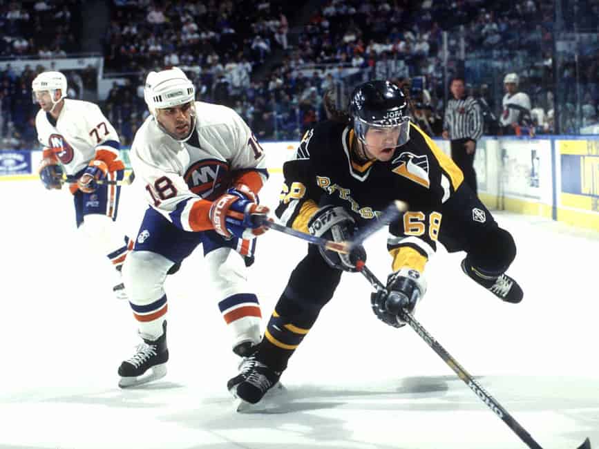
I attempted to locate some inspiration for these jerseys by looking back into the history of Pittsburgh Penguins jerseys. I managed to locate a few sites (of varying repute) which helped me in my quest to find some logic in these jersey designs. My first and only stop ended up being the jerseys of the 1983-84 season. After doing some digging, I found out that these yellow abominations were worn exclusively as their home jerseys during that year. Noting the dominant yellow chest and back, and a distinct lack of white, except for the small stripes, it’s a safe wager to assume these served as the muse for the creation of the new Stadium Series jerseys. And while I genuinely dislike them, Mario Lemieux tends to make anything look good…
https://t.co/UuinPPKevz via @SInow
— Joshua Crockett (@joshuajcrockett) November 28, 2016
Fails the Eye Test
I’m no fashion expert. Heck, I used to think cardigans were actually named after that band with that infectious 90s tune. That being said, I know what I like, and these jerseys aren’t something that “wets my whistle.” While it does offer a kind-of-cool-looking “keystone” logo which culminates in a couple of hockey sticks, the American Football-inspired numbers look just a little bit off, given their unusual white breakup. I realize that it’s an homage to olden days of Pittsburgh yore, but it kind of feels like I’m staring into the grin of someone who’s drunk an awful lot of coffee in their lifetime. Maybe I’m wrong. Maybe these will be a hit! Even if they are, they’re just not for me. Even if Mario were to wear it, they’re not for me.
Popular Articles






























 Blackhawks Chicago
 Panthers Florida
 Penguins Pittsburgh
 Rangers New York
 Avalanche Colorado
 Kings Los Angeles
 Maple Leafs Toronto
 Bruins Boston
 Capitals Washington
 Flames Calgary
 Oilers Edmonton
 Golden Knights Vegas
 Islanders New York
 Sabres Buffalo
 Red Wings Detroit
 Flyers Philadelphia
 Senators Ottawa
 Lightning Tampa Bay
 Devils New Jersey
 Hurricanes Carolina
 Blue Jackets Columbus
 Predators Nashville
 Stars Dallas
 Jets Winnipeg
 Wild Minnesota
 Blues St. Louis
 Mammoth Utah
 Sharks San Jose
 Canucks Vancouver
 Ducks Anaheim


