


 Panthers Florida
 Maple Leafs Toronto
 Golden Knights Vegas


 James Nichols
The Hockey Writers
James Nichols
The Hockey Writers
53
Reads
0
Comments
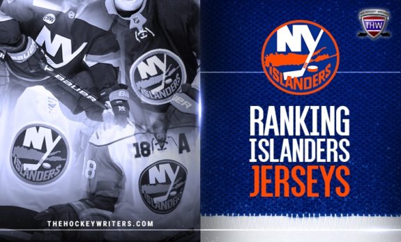
Ranking the Islanders Jerseys
For the most part, when you think of the New York Islanders sweaters, you really only think of the blue home and white road sweaters that have been around since the 1972-73 season (minus the names on the back).
Since then, not much has changed on those uniforms, and honestly, that’s a wonderful thing. The home and road uniforms are classic looking clean, traditional sweaters, and there is no need to change anything about them.
Related: Buffalo Sabres Jersey History
That being said, there is no reason the Islanders and the NHL can’t have a little fun with an alternate or third jersey. A few days ago, an Islanders’ orange jersey concept took Isles Twitter by storm.
Some fans loved the concept that tied much of the Islanders’ history together on one sweater, and others couldn’t stand to see the sight. That got us thinking, what would fans want to see in an alternate sweater? Well, we ran a poll, and 58.8 percent of you want to see the fisherman make a much-anticipated return. After that, it was close between a new orange third jersey or not making changes to the current alternate sweater at all.
So this got us thinking, where do the Islanders sweaters throughout history rank? Let’s dive into the jersey history, starting with the worst, to the best.
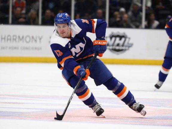
#11 2011 – 2014
Ah, Mark Streit, the former captain of the Islanders. And a great captain he was. What’s not great in this photo is the sweater or rather an entire uniform he is wearing.

Let’s be real, there is absolutely nothing about this jersey that says New York Islanders. The most you can say about this sweater is that it says the word “Islanders” across the chest, and has the crest as shoulder patches, but in 2011, if you were sitting in the nosebleeds looking down at the ice, you might ask yourself “wait, who’s in the black uniforms?”
This alternate jersey was introduced for the 2011-12 season when the Islanders were nearing the end of their lease at the Nassau Coliseum, and the team was kicking the tires on the idea of a move to Brooklyn. There aren’t many fond memories while the team wore this jersey.
Related: Edmonton Oilers Jersey History
The team had only one winning season between 2011 and 2014. In the 2012-13 lockout season, the Islanders met the Pittsburgh Penguins in the opening round of the Stanley Cup Playoffs, dropping the series 4-2.
To sum up the memories of the Islanders wearing this sweater, the team posted two losing seasons, and one was cut short due to a lockout. Yes, they made the playoffs that year but the atrocity that is this uniform did not make its debut in the post-season.
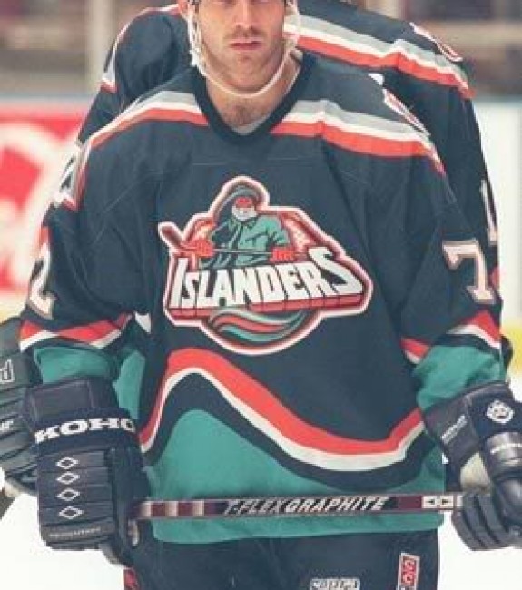
# 10 1996 – 1998
If you could find a person who didn’t enjoy Zigmund Palffy in an Islanders sweater, send them to a secluded island to be alone with their thoughts because they’d be the only one.
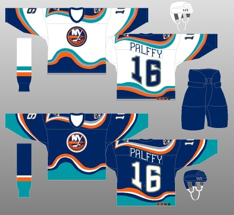
However, that doesn’t necessarily mean they had to enjoy him in THIS sweater. This obviously isn’t the worst sweater in Islanders’ history, but it comes very close.
The problem here was that although the fisherman is beloved by some today, it marked a dark time for the Islanders organization, as so much had gone wrong the year they introduced the fisherman in 1995. We will get into the history of the fisherman later, but the Islanders attempted to fix the updated look when the fisherman went wrong.
Merging the two eras together to form one didn’t make sense with the Islanders’ crest and of the rest of the jersey. The crest doesn’t support the new teal color the organization tried to introduce, while the wave and logo made the proportions of the jersey look off.
The 1996-97 and 1997-98 seasons while wearing this sweater were both largely unsuccessful, with the Islanders only accruing 70 and 71 points, respectively. The only positive that came out of these sweaters had nothing to do with the uniforms themselves – Palffy posted two seasons of 45-plus goals and broke the 90-point plateau in the 1996-97 season. After Palffy, there was a large drop-off in point production.
No one is calling for this sweater to return, and it’s better off that way.
#9 2015 – 2017
Oh, look, another black sweater design. These aren’t necessarily a bad looking sweater, but it could have been done so much better. The Islanders introduced these sweaters as the team started their tenure in Brooklyn.
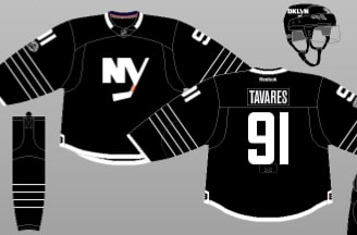
Understandably so, the team looked to connect with their Barclays Center co-tenants, the Brooklyn Nets, with these jerseys, to merge their identities as Brooklyn’s teams, but lost sight of the Islanders’ identity in the process.
“It was extremely important to ensure that our passionate fan base could still see the traditions of the New York Islanders represented in this third jersey,” Islanders general manager Garth Snow said in a team statement. “We feel we’ve created a jersey our players will be proud to wear that has unique features which will also connect with Brooklyn residents.”
Yeah, they struck out on the “tradition.” The design was largely based on the Islanders Stadium Series sweater they wore the year prior, with a few tweaks made to the jersey. The four stripes on the sleeves pay homage to the four Stanley-Cups from the dynasty years. However, you won’t find any black stitching on the jerseys worn during the dynasty years.
Related: Winnipeg Jets Jersey History
The concept made sense at the time – market the team for the new city they are playing in. The issue is, they didn’t market them well, and Brooklyn was an ultimate failure as a destination for the Islanders, making these uniforms an easy memory to forget.
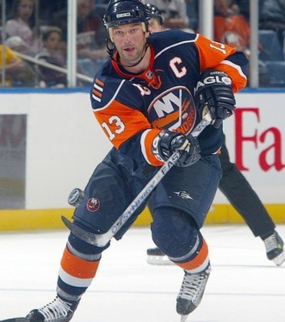
#8 2002 – 2007
We’re starting to get into the line of jerseys that when you look at them you probably think “yeah, that’s not so bad.” The Islanders introduced this stand-out jersey for the 2002-03 season, the first, and only, orange-based jersey in team history.

Things were starting to trend up for the Islanders after this sweater was introduced. In the 2003-04 season, the Islanders accrued 91 points and made their way to the playoffs, where they were out-muscled in the first round by the Tampa Bay Lightning.
This jersey marks the beginning of change for an Islanders team that had long suffered under the watch of former head coach AND President of Hockey Operations, Mike Milbury *gags.*
Now you might say to yourself, “but this jersey doesn’t have anything Islanders about it just as much as the black alternates,” but you’d be wrong. It has the crest, and Islanders colors. The beauty of this third jersey was that the team didn’t try to re-brand itself. This sweater was for fun. A new way to excite fans, make some money and show their colors throughout the crowds of the Nassau Coliseum.
By the 2007-08 season, the Islanders moved on from this sweater, but if fans are itching for an orange alternate, it might not be a bad idea to start with this one.
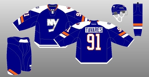
#7 2007 – 2010
The Islanders attempted to rebrand themselves discreetly from 2007 to 2010. The team kept the colors that represent the Islanders and maintained the commemorative patch on the shoulder that reflects the dynasty years. In the 2008-09 season, the team added a fourth stripe to the hockey stick in the Islanders crest with the same purpose. Plenty of Islanders sweaters afterward followed this same trend.
The one downfall to this jersey is the numbers on the front chest. Numbers belong on the backs of jerseys, and it makes for too much traffic on the front, especially for those who have captains patches, or any other patch possibility such as an anniversary.
The Islanders had more of the same success in this sweater as they had with the hybrid wave jersey from 1996 to 1998, minus the superstar caliber player they used to have in Palffy. In fact, their highest scorer in the tenure of these sweaters was Streit. The former captain tallied 56 points in the 2008-09 season, which isn’t saying much.
The fondest memory the Islanders likely have while wearing this uniform is when the team brought back former head coach, Al Arbour, for one matchup in order for him to have an even 1500 games coached. The Islanders defeated the Penguins 3-2 in the matchup.
#6 2014-2015
When the Islanders were announced to be getting an outdoor game as part of the Stadium Series, I think most Islanders fans were taken by surprise. In the 2013-14 season, the team was set to play against their rival, New York Rangers, in an outdoor game at Yankee Stadium in the Bronx.
At the time, teams who had been selected for these outdoor games traditionally referred to their roots as far as jersey design. “We’ve seen in the past in a lot of outdoor games a kind of retro, heritage, old-school kinda look. But this is newer, more modern.” said John Tavares, the Islanders former captain (from ‘Isles unveil new jersey for NHL Stadium Series’, Newsday, 11/27/2013).
This was the first time that the public had been introduced to the secondary logo, an NY with the long stem of the Y forming a hockey stick. This was all part of the rebrand that was coming with the move to Brooklyn.
The colors were there, the new logo had been exciting at the time knowing it wasn’t replacing the original crest, and the jersey was clean. So what was wrong with it? Well, the Island was missing. The Islanders with no Island is just “ers.” This jersey lasted until the Islanders moved into the Barclays in the 2015-16 season, where they reworked this uniform to into the black design.
#5 2018 – Present
There’s not much more to say about the Islanders’ current third jersey other than, it’s fine. It matches the color scheme of the organization, they’re clean, and orange numbers are awesome.
The team introduced these jerseys at the start of the 2018-19 season. The sweater sports the Islanders’ secondary logo in the NY, and minor details make it unique, such as the image of Long Island on the inside neck.
The one problem with this alternate is the secondary logo. With the Islanders officially moving on from the Barclays Center, all things Barclays-related should be eliminated from the organization. The Islanders need their identity to be back on Long Island, and the secondary logo on this jersey screams Brooklyn, so the team will need a new alternate look going forward.
#4 1995 – 1997
So, of course, this design comes to mind when thinking about a new alternate moving forward.
Really? Ranked this high? Don’t you know this was the lowest point of the team in its history?!
Well, let’s relax for a second. By no means should the fisherman replace the Islanders’ main jerseys what-so-ever, but take a look around the league right now. The NHL is having some fun marketing their jerseys and letting clubs revive their former uniforms.
The 1995-96 season wasn’t fun, by any means. Milbury was both the head coach and general manager, Rangers fans mocked the Islanders with “We want fish sticks” chants, and the team missed the playoffs by a landslide, with only the Ottawa Senators finishing below them.
But think about it. If every team had to change their jersey because of some dark times in their history, then are you going to go on the record saying that the Detroit Red Wings should switch up their uniforms from the classics they wear every night? If so, go find that Palffy Island we referred to earlier.
If you can put all the darkness in the past, the fisherman makes for a great third jersey option. The Vancouver Canucks are looking sharp with their “skate” jersey, the Anaheim Ducks are Mighty again, and the St. Louis Blues brought back the retro red swoop!
This remarkable photoshop job advertises Mat Barzal in the orange, teal, and blue, and honestly, it’s sharp looking. The Islanders are officially done with Brooklyn and moving forward, they should look to wipe out anything that resembles the failed move to the Barclays Center, which includes their current third jersey.
The team has been selling fisherman apparel for the past few seasons. A plethora of clothing has been put on the market sporting the fisherman, from hats to jerseys to sweatshirts.
The team has even gotten into the spirit of the fisherman, as captain Anders Lee ordered a classic white Islanders baseball cap sporting the fisherman and the retro colors.
You may disagree with the idea of bringing back the fisherman, but it’s more Islanders than any of the previous alternate jerseys mentioned above.
#3 1998 – 2007
After the failed fisherman experiment, the Islanders organization made the right call in going back to their roots. The slight difference between these sweaters and the originals is the shade of blue that’s used. This Islanders sweater rocks more of a navy blue, rather than a royal, but resembles that of the dynasty era jersey.
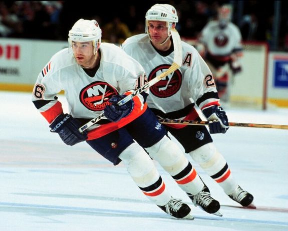
The team added the shoulder patch for the first time in 1998, in an effort to send a message to its players and fans that the team has a constant reminder on their shoulder, literally, to strive for another Stanley Cup.
Perhaps the most memorable time while wearing this sweater was the 2001-02 season. The beginning of Peter Laviolette’s coaching career with the Islanders couldn’t have started better – he elevated the play of a team that hadn’t sniffed success in a number of years, dating back to the 1992-93 season.
Alexei Yashin, Mark Parrish and Michael Peca led the way for the Islanders that year, but it was Shawn Bates who walked away with the most memorable moment that season.
The penalty shot heard around the world resulted in one of the largest explosions of cheers from Islanders fans any fan of the game has ever heard. Although the Islanders ultimately lost in the first round to the Toronto Maple Leafs, the team finally saw the success they hadn’t had in a long time.
#2 1972
The inaugural jersey the Islanders repped when they first came in the league is much like the sweaters you see the team wearing currently. The only major difference is the orange numbers on the back and sleeves, and there were no names on the back.
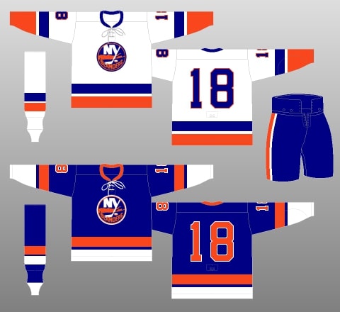
These classics were revived for the final game to be played at the old Nassau Coliseum back in the 2014-15 season. The organization had the team wear the sweater to pay its respects to the building the Islanders had called home since their debut in 1972.
Ed Westfall and Co. weren’t hot out of the gates, as the Islanders finished eighth in their conference and last overall in both goals for and goals against.
Despite the tough start to the team’s tenure, the Islanders were in just the beginning stages of something special, and these jerseys were the start of the classic jerseys the team wears today.
#1 1973 – 1995, 2008 – Present Day
Ah, there it is. The classic Islanders sweater. And what a beautiful sweater it is. This is the sweater that the Islanders are known for.

Throughout the league, there are some classic jerseys. The Chicago Blackhawks, the Red Wings, the Rangers and plenty of others have all seen their original designs unchanged, and thank goodness the Islanders decided to revive the only jersey they should ever wear again in 2009.
This is the sweater that saw the dynasty era lift four Stanley Cups, the sweater that was worn the year Mike Bossy scored 50 goals in 50 games, the sweater that was worn for all the numbers that have been sent to the rafters.
The Islanders’ identity is in the orange and blue they wear today. It is their past, it is their present, and it certainly always should be their future. This is the best version of the Islanders sweater because it’s the ONLY version of the Islanders sweater.
With the lack of hockey news and games, this will be in the front of Islanders fans’ minds for some time. Luckily, you can tune into the Nassaumen Hockey Podcast, brought to you by The Hockey Writers, for weekly conversations about Long Island’s team. Subscribe on Spotify, Apple Podcasts, or Google Play.
The post Ranking the Islanders Jerseys appeared first on The Hockey Writers.

Popular Articles